.jpg)


http://psd.fanextra.com/tutorials/photo-effects/quick-tip-learn-how-to-create-a-vintage-photo-effect-in-photoshop/
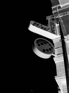
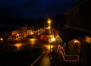
This week I work with value and contrast. In one of my images I try a toturial that I saw online. I added next to the photo. Right now i'm only working in Hood River . Maybe my next photos will be more about Portland. What i would like to try next is contrast them with each other.

.jpg)

.JPG)
.jpg)


I think these photos are really great. It seems hard to take photos of building landscapes because of how busy buildings tend to be. Although you captured your point perfectly in these and it doesn't seem busy at all. I also really liked your value and contrast photo of that building in Portland.
ReplyDeleteYou've made great progress on your series! I really appreciate the variety of pictures. You explore close ups and wide shots, night and day, Portland and Hood River, interior and exterior. I think you editing is effective in most images. The only thing I would be careful of is including cars in your images. If they are in the picture, they need to look intentional, not like an after thought. One question, how did the billboard picture end up with the writing being backwards? Did you flip the image in Photoshop? Overall, you've made great progress! Keep up the good work!
ReplyDelete